Adventure two involves my grandmother's green thumb and her camera. ^-^
I found it adorable how much pride she takes in her flowers. And as she was telling me about them like she always tends to do when I come over I got to thinking about how I never really take pictures of flowers that often. I tend to stick to creepy portraits. I asked for her camera and decided to have an adventure in uncharted territory. It was interesting taking the photos because I must have been very spoiled over the school year being able to use mrs Bjorks cameras with manual zoom. But after awhile I got used to it. Once I had all the photos I used the website Picnik to alter them so it is my own style. (Again i've been spoiled with photoshop in the mac lab all year.)

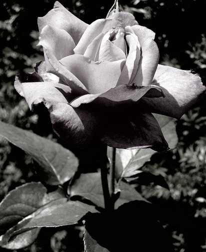
A: I have always been attracted to black negative space playing a big role in a picture. This photo has no distractions with the rose not having to compete with anything else. I find all the shadows to be rather beautiful and mysterious. I like that the texture of the rose was captured. It has a very balanced symmetrical composition which is something I don't usually lean towards. This flower is actually bright pink but I made it more of a dull red.

B: This is the original flower in all it's wonderful pink glory.

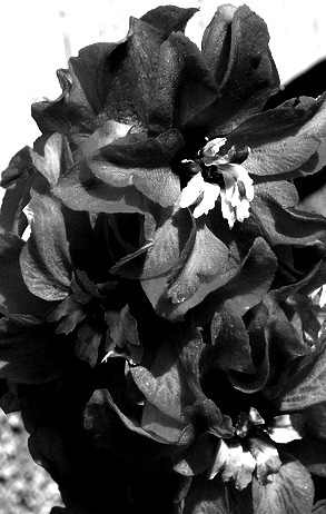
C: What I like about this photo is that there is so much falling off the sides which is one thing I have a problem having in my compositions. I think the rule of thirds is used in this photo and the repetition of shapes. The main emphasis is on the three flowers. Three is one of the magic numbers that the brain is attracted to. I like the little bits of negative dark space in between.

D: I love this one because I usually don't use black and white all that often but that day it was highly attractive in my eyes. The sun light created beautiful natural shadows and light areas. The flower somewhat in the middle takes up most of the emphasis however the rest is not forgotten about. I like the detail in half of the flower and the other half being engulfed in sunlight. The different levels the leaves in the upper left part create a sense of depth as well.

E: I like that this photo has a sense of abstract vibe to it. It sort of looks like it could have been very different photos edited together because of the diversity of styles all captured in one.

F: This photo has a somewhat abstract feeling as well but at the same time you can see what it is. It just seems like more than one layered photo. I like the leading lines that the stems create that lead your eyes through the picture. And the little bright pink this in the corner looks like it belongs on another planet. :D

G: This photo is so unlike the usual me because of how light and pretty it is. There is no black negative spaces. This photo uses asymmetrical balance and emphasis on the flower bundle to the right. It makes me smile:)

H: And back to the black dark negative space. This is the same photo as A but completely black and white. I liked both and could not choose. It's like a serious but breath taking portrait of a flower. I learned you do not need a person to make a portrait. Flowers are more than mere props or backgrounds. When you really see them close up they are a beauty all their own.

I: This just might be my favorite of this collection. There is just something about the composition that surprises even myself. There is a strong rule of thirds with balance, repetition, contrast, negative space, texture, and depth. I think it is beautiful.

J: This photo uses emphasis with the flower being the focus. The stem leads the eye up to the flower. I like how the lines of the wall in the background is going the opposite way as the stem lines.

K: This photo has symmetrical balance and high contrast and emphasis. I like the natural shadows the sun casted and created nice texture and emphasis on the middle flower.

L: What I liked about this one is that I took a pretty pink rose and made it dark and not really a flower any longer. It has an asymmetrical balance with a lot of dark negative space.

M: Black and white version of the rose. :)

N: This one is nearly black and white but not quite. Which is what i like, the subtle use of color. The sun creates pretty light and dark spaces. The balance is asymmetrical.

O: I love the texture the flowers have and the depth the shadows create within.

P: This photo uses symmetrical balance and leading lines mainly.

Q: This photo is balanced but not symmetrical. The main focus is on the group of leaves to the right. There is repetition in the shape of the leaves and some nice contrast and texture.
R: This one on the other hand in balanced and pretty symmetrical. I like how the negative space is white o the top but black at the bottom.

S: This one I made into a pattern. It turned out better than I expected. I like the small bit of yellow at the bottom left. It looks like paint it me. :)

T: This one was also meant to be more of a pattern style with all the altered colors but you can instead in this one actually see clearly what the photo was initially.
A lot of these will be turned into paintings this summer most likely.