Amber and Jessie's Summer Photo-Shoot!:D Wooooo!!!:D

I love the tense feeling in the fingers and the shadows. I like that the emphasis is on the fingers by cutting out the eyes. It gives off a creepy vibe which is my favorite:)

This one also has that vibe. The light comes up from underneath which is a usually unflattering angle but it creates wonderful interesting shadows.

I like the seriousness in her eyes. Eyes are the window to the soul. And that is exactly what I see when looking at this. There is a nice connection between viewer and subject. The light is once again coming from underneath creating a lot of shadows.

I have a tendency to find the littlest of things to be my favorite. In this case that rings true because my favorite part if this picture is the texture on the wall in the upper left corner. I also like how only half of the face is shown while the other is engulfed in shadows.

I love her makeup in this one. There is little shadows so everything is shown. The black lines I find to be beautiful. The color in the stripe goes against the way of the other lines and it leads you through more of the picture. The photo is also very asymmetrical.

This one I obviously made the eyes fully black.I wanted to have a sort of alien-like look about it. The face has a soft yellow, blue and violet tone about it and it contrasts with the darkness of the eyes.

The photo is asymmetrical. The eyes match the strap on the shirt. The eye shadow matches the lips.

There is definitely a sadness about this picture. I was warned that having the eye and makeup match is a bad idea because it ends in a toned down all over color. But I sort of wanted that effect. If the photo is meant to have a sad vibe then there should be little life. The shadows create interesting shapes.

cute! ^-^

I usually tend not to have photography where the eyes have direct contact with the viewer however I am very glad that I did in this instance. This photo is very asymmetrical and off balanced. There is dark negative space on the right.

This photo is very creepy with how dark it is. The hand creates tension. You can barely see the eyes. The shadows run together with the eye liner, hair shirt and hands. The head is very in the middle with the hand still throws the balance off.

This photo like many before it has an asymmetrical balance. I especially like the likes in the back. Half the face is in shadow and the other half is well lit.

This one has a warm tone to it and again half of the face is in shadow. I absolutely love how the light passes through the eye on the left.

I like the blue tones that is consistent through out the photo.I also like the little bursts of pink.

I have some other photos with this concept of finding the light in the dark. It seems to be a concept I cling to. This photo treats light as something very delicate because most of it is dark.


 In these two we explored the difference that a warm and cool background makes. The first one obviously has a cool background which recedes back causing the subject to pop forward. The second one with the very warm background is more chaotic because the background is battling with the subject. It would work better if the subject wasn't predominately warm as well.
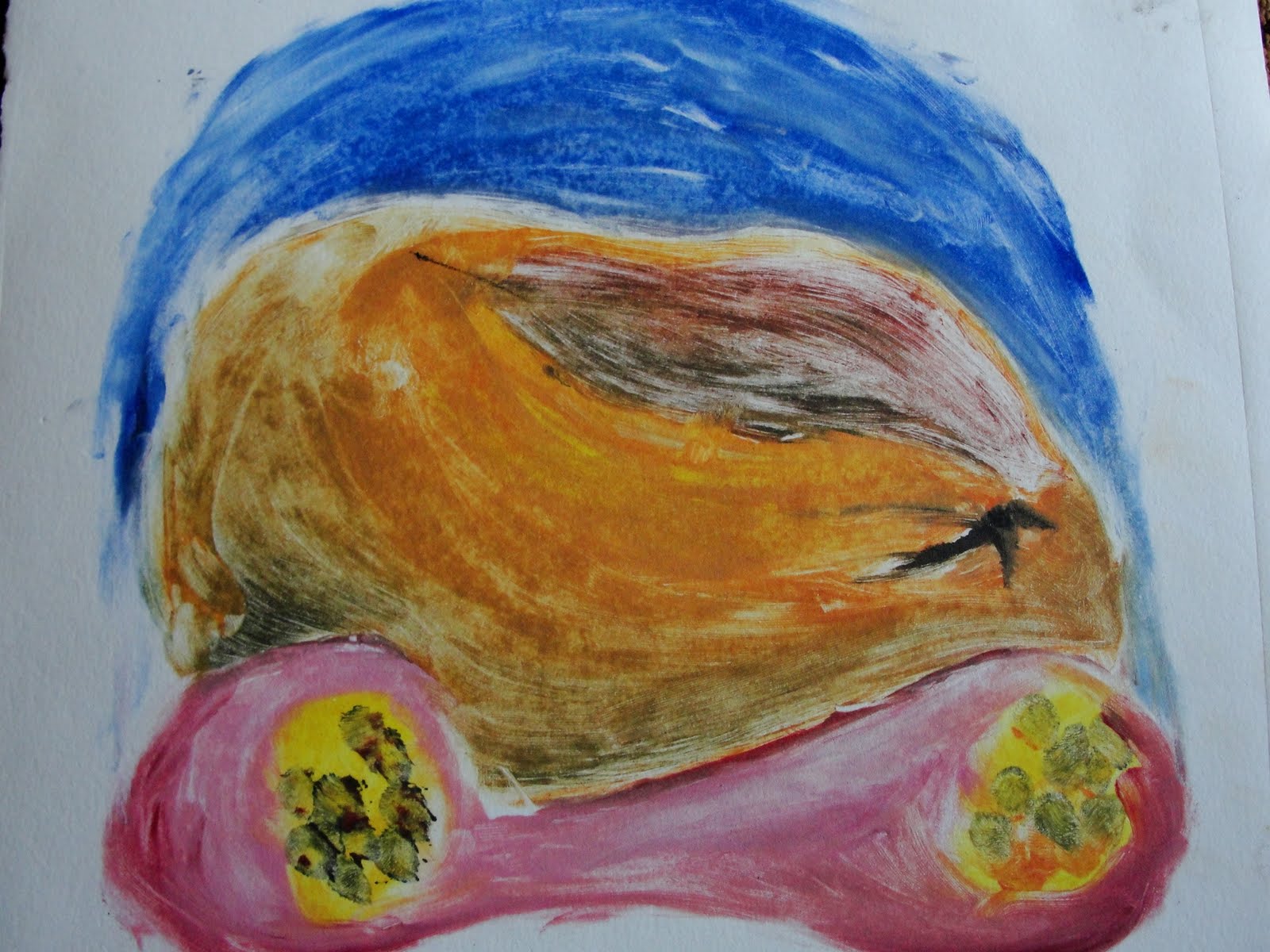
 I am now the only comuter in my painting class so I could not stay after and paint the fruit still life he had wanted us to do for homework. So I decided upon painting my favorite shell instead. The first one is of lipstick and another shell as well. The second includes the part of celery no one likes. The last one includes some other small shells. There is a mixture of brush and palate knife marks used. The first one has linking colors theme about it. The second uses the celery as steps almost to reach the shell.


